Christmas in Idaho - Typeface

Didot, the queen of French typefaces
A typeface is a set of letters, numbers and symbols in the same style that is used for printing.
Open and elegant, Didot is a beautiful typeface with minimal embellishment, strong contrast and mathematical precision.
It requires high quality paper and printing that can hold its fine lines without breaking up.
Named after the French Didot family, famous as printers and type producers, the typeface was developed from 1874 to 1811 by Firmin Didot.
By 1811, Firmin had been named printer to the Institut Français, and in 1814, Napoléon appointed him as the Director of the Imperial Foundry, a position he would hold until his death.
The Didot typeface would be considered the standard in French printing for over a century, and we are proud to showcase it in our 21st century book Christmas in Idaho, written and illustrated by Ray Downing.
💠 We are delighted with our choice.

Blog Archive
Read about how the book Christmas in Idaho came to be, in the author’s own words.
“This book is one of those beautiful and lavish treasures and it’s not aimed specifically at young children. I’d say this is more of a family discussion book. Or a family treasure book. A Christmas tradition book you can discuss with your family and enjoy year after year.”
“I bought the book because I love my Idaho home. I found so much more.”
Christmas in Idaho, a book by Ray Downing. “The book combines a sense of magic and spirituality with a fantastical Christmas adventure like no other.” Book review by Ethan Hunt, Idaho Falls Magazine, December 2022.
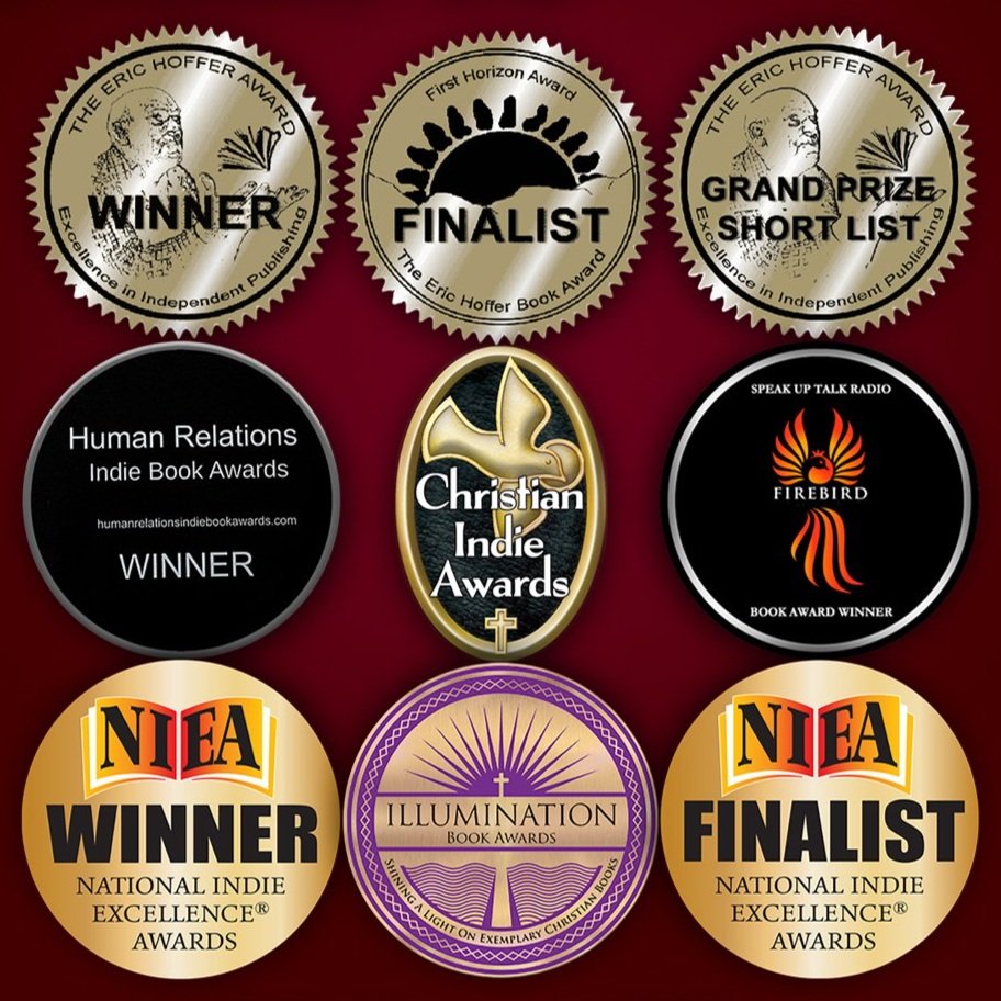
Christmas in Idaho by Ray Downing, Human Relations Indie Book Award winner.
Christmas in Idaho by Ray Downing, Christian Indie Book Awards winner.
Christmas in Idaho by Ray Downing, Christian Indie Book Awards finalist.
Ray Downing’s beautiful and inspirational book Christmas in Idaho has won prestigious awards in several categories.
Christmas in Idaho by Ray Downing is First Runner Up in the Short Story category in the prestigious Hoffer Book Awards.
Ray Downing’s book Christmas in Idaho took first prize in three categories: Audiobook, Gift Book and Specialty Book.
Christmas in Idaho by Ray Downing, Christian Indie Book Awards finalist.
Embossing is an effect created by raising images or texts against the background.
Stochastic printing preserves the photographic appearance and the smooth color transitions even under a loupe.
…he became the main character in this Christmas adventure of awakening, hope, loss and survival.


